INTERACTIVE DESIGN - PROJECT 1

13/09/18 - 20/09/18 ( Week 3 - Week 4 )
Chong Siong Loong Ron ( 0334452 )
Interactive Design
Project 1 - Landing Page Design
LECTURE NOTES
20/09/2018 ( Week 4 )
For this week, Mr Shamsul gave us a lecture on type for screen. Intro of the lecture, we learned about how presenting beautiful type on websites nowadays are easy as there are popular wed font services such as Adobe Typeset and Google Fonts. Back in the old days, there were very limited choice of typeface such as Arial, Verdana, Helvetica, Georgia and Times New Roman. The last thing was the wed safe colours, wed save font as well as system font which are the fonts that are installed in the operating system.
INSTRUCTIONS

13/09/2018 ( Week 3 )
We were given the brief on our first project, in which we will be designing a static landing page for any one of our favourite singer, band, sports team or movie. we should research on the size/ resolution that will be used. In our landing page, we need to include a call-to-action. Colour can be used as well as any fonts from google fonts . We should also looks up to read about mobile friendly websites even though we are designing for a desktop.
I decided to go with one of my hobby which is eating hahaha, I am to Create a fake restaurant websites, and my target audience are people who wants to come my restaurant to have a meals. The goal of the websites is to allow customers to book their table online and before they come to our restaurant they can have a look on our menu before they make their decision where to have a meal in our restaurant or not, I decided to go with the western menu for my restaurant.

1.1 Notes and sketches

1.2 Sketches

1.3 Sketches

1.4 Reference

1.5 Process of landing page

1.6 Landing page

1.7 Process of landing page

1.8 Screenshot of final layout
Final outcome of my 1st own Landing page design

FEEDBACK
20/09/2018 ( Week 4 )
General Feedback : The first project, our landing page should have a footer, and the content in there shouldn't be cluttered. The arrangement of the element should also be even and have enough white space. Grid should also be used because alignment is important.
Specific Feedback : Mr Shamsul said that my sketches is clear and I know what I want to put in my website and I did enough of research to know what to put in my landing page.
REFLECTION
EXPERIENCE
10/09/2018 (Week 3)
I some browsing through many different websites of restaurants to have an idea of what sort of content they have in their websites. After looking through the websites I did a few sketches.
20/09/2018 (Week 4)
for this week , we have to start to design our landing page for me its was pretty interesting and fun because it was my 1st time design a landing page for website.
OBSERVATION
10/09/2018 (Week 3)
After going through so many websites I notice something that all of thew websites I visited has a cover image with this name or logo of the restaurant following with some text below.
20/09/2018 (Week 4)
I observed that what we design or sketch in paper is kind of different when we move it to digital because what u see on paper may be nice but after we move it to our computer its either too small or too big or too much info one page etc. Its not easy to design a functional landing page.
FINDINGS
10/09/2018 (Week 3)
I was a little confused on what to put or is the alining page too empty at 1st like what I said in observation after moving in to illustrator its just nice and is not too empty.
20/09/2018 (Week 4)
I totally enjoyed the landing page because I was able to do what we want, white some other project where we are restricted to do the project , and I found out that looking at food or restaurant websites their photography is very important because just by looking at some websites food picture my mouth will start to water, so I found out that photograph used in websites is very important.
FURTHER READING

Article : "Mega navigation menu design trends in modern websites"
We’ve all seen mega navigations and fullscreen dropdowns online. They’re common across the web and especially useful on sites with tons of links.
But designing a mega nav that works can be a real pain. There are no strict guidelines for these menus so you have to study what others are doing and try to make something that’ll fit with your project.
Deep Level Categories
The most valuable design style for a mega nav is the column structure. This lets you designate “categories” for links and create deeper links without using multiple flyout menus. A mega navigation dropdown can span the entire page so you can usually fit at least 3-4 columns in one dropdown.
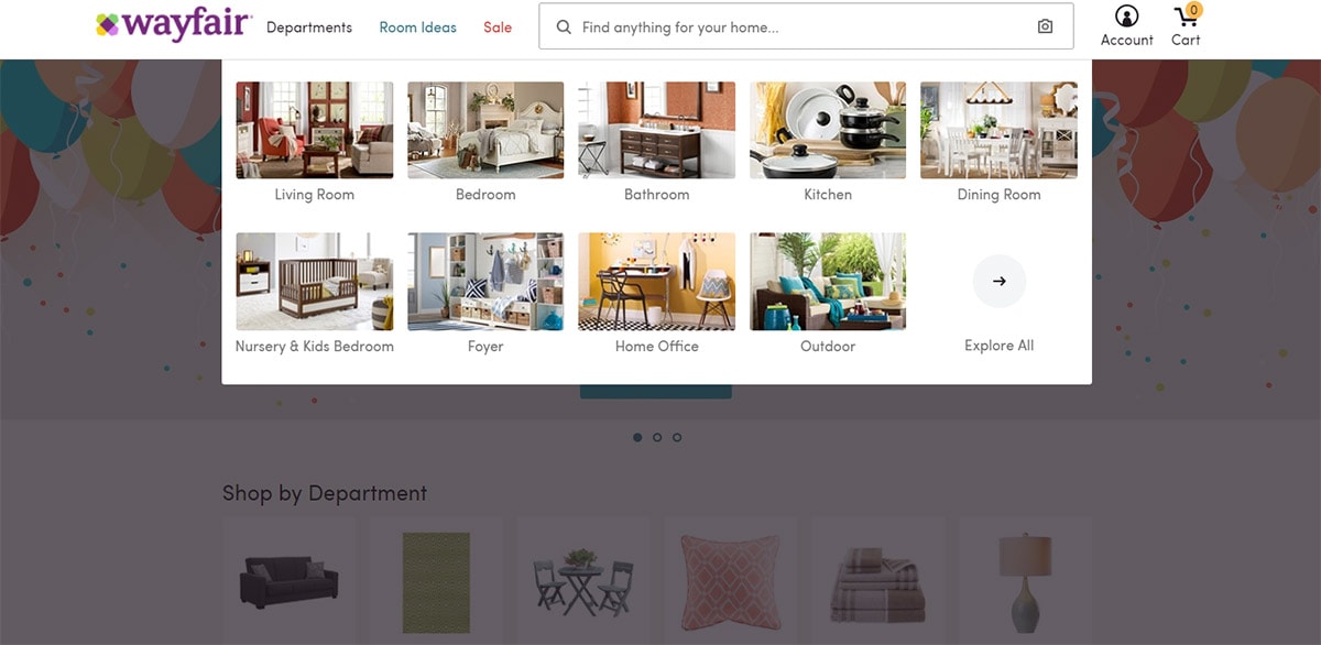
Take a look at wayfair which uses a very unique type of dropdown menu. They have a link for “departments” where you can browse by category and even sub-category such as bedrooms > nightstands.
Full-Width Drop-downs
This trend isn’t used on every site but I do see it a lot more nowadays. Huge mega navigation menus can span the entire width of the page to create more room for desktop & laptop users. Mobile users typically have hidden menu so they never really see the full effect anyways.
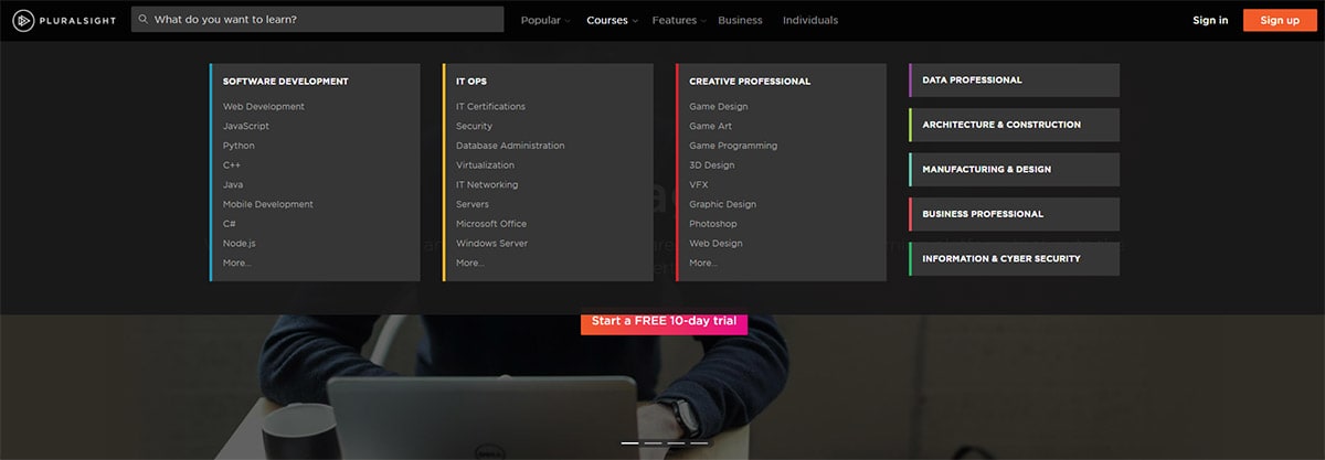
The navigation for pluralsight is an excellent example featuring a fullscreen mega menu. The content stays fixed at the same width as the page itself, but the menu does span the entirety of the screen.
Mixing Images & Text
I encourage adding more images to all websites whenever possible. Visuals help to break up all the text we see on a regular basis. Mega nav menus work best on larger screens so it’s safe to say there’s room for images. The sears website breaks up their nav into multilevel categories with both links and images.
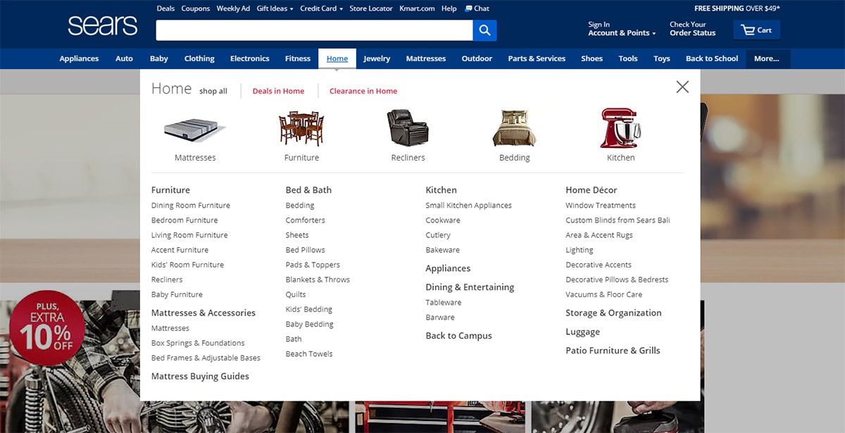
Some of the top categories have images for kitchen appliances, mattresses, and home furniture. But the deeper categories include direct links to things like cutlery and tableware.


Comments
Post a Comment